My "guide"
Claude Monet
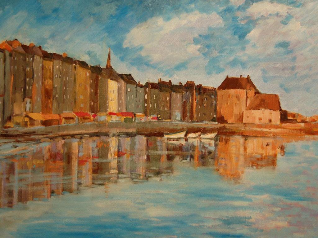
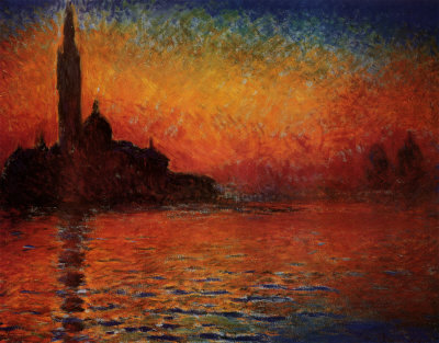
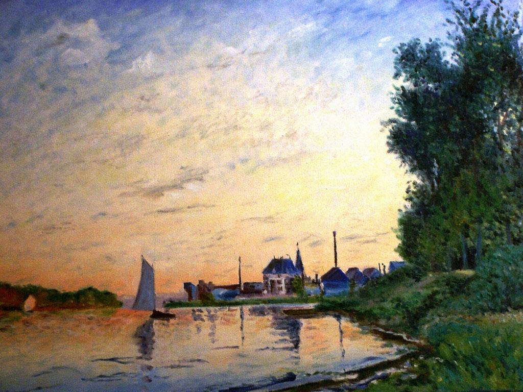
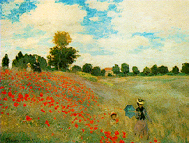
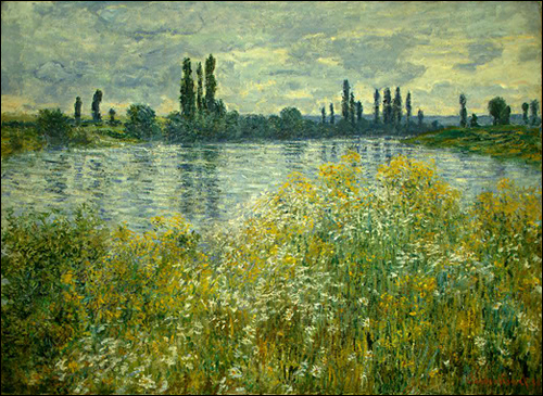
Claude Monet was a French painter in the 1900s. He was a founder of French impressionistpainting, and the most consistent and prolific practitioner of the movement's philosophy of expressing one's perceptions before nature, especially as applied to landscape painting. The term Impressionism is derived from the title of his painting (Impression, soleil levant). Monet painted landscapes, cityscapes (only a few of those, though) and people. He seemed to particularly enjoy painting women and landscapes.
He was an impressionist and painted mainly with oil paints and canvas, using very characteristic small strokes and dabs of paint. Many of his paintings transmit a tranquil, soft feeling to the beholder because of this. He generally didn't use strongly contrasting colors or very strong colors, either. (But he did use the latter occasionally). His inspiration was when he saw beautiful views and then drew them as he first saw them on canvas. The beauty of the land inspired Monet at different times of a day. When he saw things he liked he would just sit outside and start to paint them.
Process of his painting: How to create a Monet Painting
Step 1 – Use a coloured ground.
From the Old Masters to Monet using a coloured ground is a technique that is often forgotten in the art room. It helps to take away the glare from the white of the canvas and gives you a mid-tone to paint onto. The technique is so easy to implement and will rapidly improve your painting almost instantaneously – It’s number 1 in my painting principles.
Step 2- Drawing out
The next stage is to draw out the basic shapes in the piece.
Step 3 – Setting out the palette
I then layout my colours onto a tear-off palette. If you want a bit more working time with your acrylics then you can set out your paints onto a stay-wet palette. There is a video tutorial below on how I would usually set out my colours on the stay-wet palette.
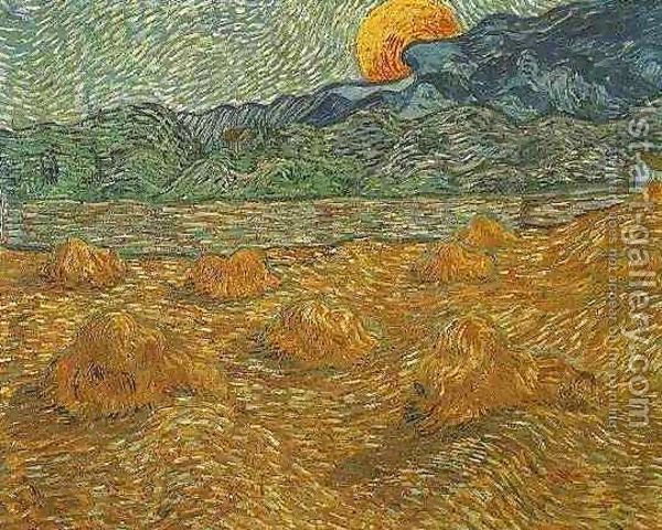
Monet often began with a rapid blocking in of the colours, as he was working within the constraints of daylight.
When painting subjects ‘plein air’ the colors in nature can change very quickly as the sun moves position throughout the day. The lower the sun is in the sky, the warmer the light, with sunrise and sunset having a warm color in comparison to the cool blue light of north light.
Monet seemed to favor this warm light as it gives such a rich variety of tones in one scene. Some of the light techniques he was trying to achieve only lasted for less than 10 minutes, so we have to work quickly!
We are using a hog hair brush so we can move the paint around quickly and easily, it will also enable you to add thicker, impasto paint in future lessons on this painting and be closer to the materials he would have used with oil paint.
Here are my top 6 tips for achieving a successful Impressionist painting:
1. Squint
2. Use a hog hair brush
3. Apply thick paint
4. Use complementary colors
5. Mix color on the canvas
6. Adopt an impressionist palette
Step 4 – Wash in the sky
Using Cobalt blue hue and water I add a very loose watery wash to the top of the sky. I’m just trying to establish some basic colors in the piece.
As the sky becomes lighter towards the horizon I add Titanium white to lighten the mix. During this process I’m painting very quickly using gestural marks and I’m not concerned with getting it spot on, it’s a case of getting it on there and getting a feel for the painting.
Step 5 – Block in the mountain
The mountain has 3 simple mixes; you can see how it changes from left to right.
The first mix is Cobalt blue hue and Titanium white, which I paint in with a thicker mix than the sky. I then mix a turquoise by adding the permanent green light to the cobalt blue hue.
I blend these colors ‘wet into wet’ and add more of the green to the mix as I get to the left hand side of the painting to indicate an impression of trees.
Step 6 – Creating color harmony
When this color is mixed I scan the reference image for any examples of this color appearing in the foreground of the piece. This helps to unify the scene and give a movement of colors throughout the painting.
I use short strokes to apply the paint slightly more impasto (thicker) than the initial wash in we used for the sky.
These dabs of color help to move the viewers eye around the painting.
I then add Cadmium yellow medium and a touch of Titanium white to the mixture to vary the tints slightly.
Claude Monet was a French painter in the 1900s. He was a founder of French impressionistpainting, and the most consistent and prolific practitioner of the movement's philosophy of expressing one's perceptions before nature, especially as applied to landscape painting. The term Impressionism is derived from the title of his painting (Impression, soleil levant). Monet painted landscapes, cityscapes (only a few of those, though) and people. He seemed to particularly enjoy painting women and landscapes.
He was an impressionist and painted mainly with oil paints and canvas, using very characteristic small strokes and dabs of paint. Many of his paintings transmit a tranquil, soft feeling to the beholder because of this. He generally didn't use strongly contrasting colors or very strong colors, either. (But he did use the latter occasionally). His inspiration was when he saw beautiful views and then drew them as he first saw them on canvas. The beauty of the land inspired Monet at different times of a day. When he saw things he liked he would just sit outside and start to paint them.
Process of his painting: How to create a Monet Painting
Step 1 – Use a coloured ground.
From the Old Masters to Monet using a coloured ground is a technique that is often forgotten in the art room. It helps to take away the glare from the white of the canvas and gives you a mid-tone to paint onto. The technique is so easy to implement and will rapidly improve your painting almost instantaneously – It’s number 1 in my painting principles.
Step 2- Drawing out
The next stage is to draw out the basic shapes in the piece.
Step 3 – Setting out the palette
I then layout my colours onto a tear-off palette. If you want a bit more working time with your acrylics then you can set out your paints onto a stay-wet palette. There is a video tutorial below on how I would usually set out my colours on the stay-wet palette.
Monet often began with a rapid blocking in of the colours, as he was working within the constraints of daylight.
When painting subjects ‘plein air’ the colors in nature can change very quickly as the sun moves position throughout the day. The lower the sun is in the sky, the warmer the light, with sunrise and sunset having a warm color in comparison to the cool blue light of north light.
Monet seemed to favor this warm light as it gives such a rich variety of tones in one scene. Some of the light techniques he was trying to achieve only lasted for less than 10 minutes, so we have to work quickly!
We are using a hog hair brush so we can move the paint around quickly and easily, it will also enable you to add thicker, impasto paint in future lessons on this painting and be closer to the materials he would have used with oil paint.
Here are my top 6 tips for achieving a successful Impressionist painting:
1. Squint
2. Use a hog hair brush
3. Apply thick paint
4. Use complementary colors
5. Mix color on the canvas
6. Adopt an impressionist palette
Step 4 – Wash in the sky
Using Cobalt blue hue and water I add a very loose watery wash to the top of the sky. I’m just trying to establish some basic colors in the piece.
As the sky becomes lighter towards the horizon I add Titanium white to lighten the mix. During this process I’m painting very quickly using gestural marks and I’m not concerned with getting it spot on, it’s a case of getting it on there and getting a feel for the painting.
Step 5 – Block in the mountain
The mountain has 3 simple mixes; you can see how it changes from left to right.
The first mix is Cobalt blue hue and Titanium white, which I paint in with a thicker mix than the sky. I then mix a turquoise by adding the permanent green light to the cobalt blue hue.
I blend these colors ‘wet into wet’ and add more of the green to the mix as I get to the left hand side of the painting to indicate an impression of trees.
Step 6 – Creating color harmony
When this color is mixed I scan the reference image for any examples of this color appearing in the foreground of the piece. This helps to unify the scene and give a movement of colors throughout the painting.
I use short strokes to apply the paint slightly more impasto (thicker) than the initial wash in we used for the sky.
These dabs of color help to move the viewers eye around the painting.
I then add Cadmium yellow medium and a touch of Titanium white to the mixture to vary the tints slightly.